Metropolises in 2020, like New York and Shanghai, disconcertingly resembled London in 1831, in that a strange new disease passed through the population leaving in its wake confusion, grief and death. 2020 was beginning of Covid-19; 1831, Cholera.
In modern times, epidemiologists are armed with hosts of models, datasets, study designs and other statistical tools to track the distribution of diseases by patient, location and time. These tools, combined with scientific knowledge of the disease itself, provide these specialists with hints at a disease’s origin and potential methods of curbing its effect.
In 1831, no such analytical methods existed and the medical community was not yet convinced that germs were even real. But an eighteen-year-old physician’s assistant named John Snow, now regarded the father of modern epidemiology, sought to change both.
As swiftly as the cholera scourge began, it ended. Over 50,000 Britons succumbed to this horrible disease before cholera seemingly vanished in early 1932.
As a boy, Snow excelled in mathematics. Marred by the ravages of cholera though, he elected to pursue a medical degree at the University of London where he graduated in 1844. This unusual combination of medicine and mathematics set the foundation for his seminal work in epidemiology; a discipline relying deeply on both.
In the autumn of 1848, London faced a new outbreak of cholera. The now 35-year old Dr. Snow was far better equipped to approach this reemergence of cholera from a new perspective.
While the majority of physicians in that era held to the “Miasma Theory” of disease communication – the idea that people contracted illnesses from the foul odors than sprung from sewers and garbage dumps – Snow’s opinion differed. Snow believed that Cholera was caused by “tiny parasites” communicated from person to person through contact with an infected person’s bodily fluids.
Snow began his investigation by carefully documenting every detail leading up to each victim’s contraction of the disease. By examining where the victim lived, worked and travelled relative to fixed landmarks like garbage dumps, sewers and water pumps, Snow began noticing patterns unexplainable using the Miasma Theory.
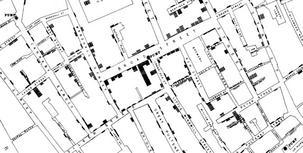
One tool Snow developed to record his findings was the Concentration Diagram. Starting with a map of the Soho district of London – the area worst ravaged by the disease – he added a short bar at the home of each person who died of Cholera.
John Snow’s cholera map of Soho, London. 1854
By analyzing his concentration diagram and detailed accounts, he discovered that most of the victims he tracked had obtained water from a single pump at the corner of Broad and Cambridge Streets shortly before the onset of their illness. On September 7, 1854, Snow along with a disinclined horde of London’s top officials, tested his hypothesis that the Broad Street pump was contaminated by removing its handle. The new cases of cholera stopped almost immediately.
The volume and sophistication of data analysis and visualization tools available to today’s problem solvers have grown exponentially since Snow’s time. But the humble concentration diagram is still commonly used as a mean of narrowing down root causes and tracking the progression of problems. Versions of this tool, like the one shown below, were again used in 2020 to chart the progress of the Covid-19 pandemic around the world.
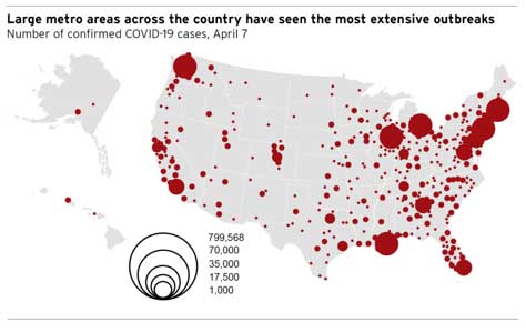
Copyright 2020 The Brookings Institution
The concentration diagram is also used in diverse areas disciplines outside epidemiology including political science, geology, economics and quality engineering.
For a quality engineer searching for the root cause of a defect, the concentration diagram serves as a tool for recording an incident of a defect by location on the assembly. The simple illustration below, for instance, shows a concentration diagram used to record blemishes found on a car bumper coming off a paint line.
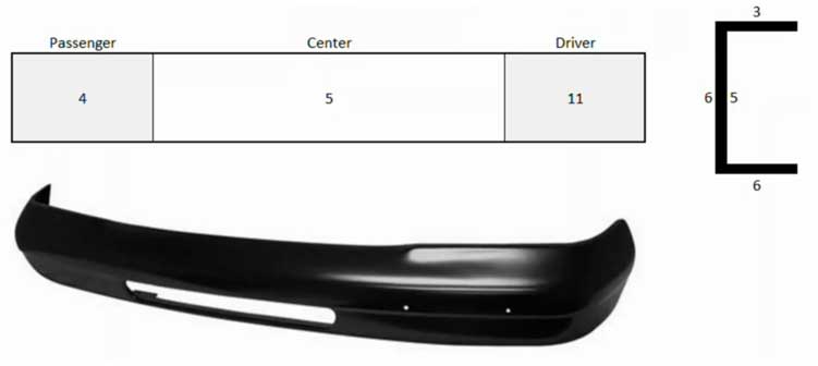
Just like Dr. Snow and his map of cholera victims, the relative concentration of defects on the driver’s side versus the passenger’s side of the bumper may provide clues as to where in the process these defects are occurring.
To learn more about the concentration diagram, and the full range of tools used in manufacturing and engineering root cause analyses, sign up for the online class “Root Cause analysis and the 8D Corrective Action Process”.